UI Designs
PublishedSorry for the late post this week, we’ve both got birthdays in the last half of November and things got a little sidetracked.
Since we’re starting to show off more of the game, now seems like a good time to start showing off UI designs, which honestly isn’t the most exciting subject, but UI design can sometimes make or break a game. A lot of it is very sketchy, but after all it is concept. We just hope these scribbles might help get our vision for the game across, since some elements of the UI might still look ‘functional’ compared to what we want to achieve.
This is a long one so take a look under the cut.
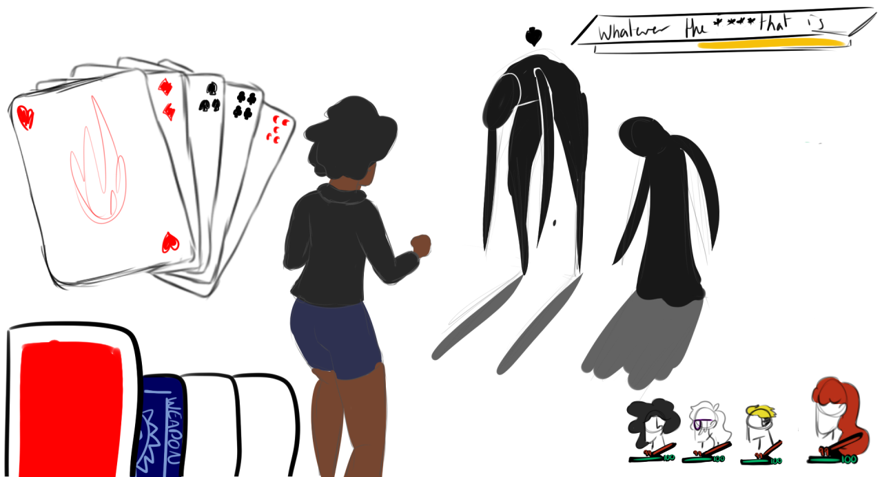
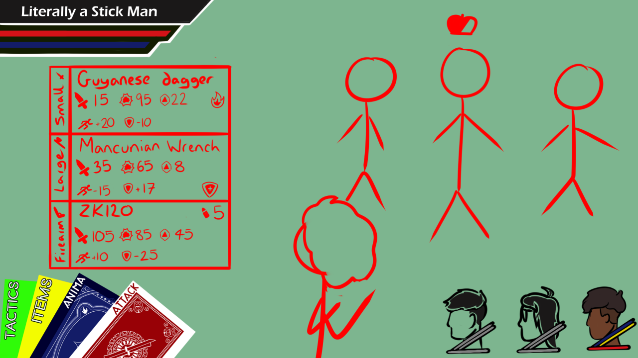
Battle UI: The first concept is the initial design, with the second being less fleshed out, but more up to date and a lot closer to what you’ll see when we release our dev update on the battle system very soon.
We mentioned in Q&A 1 that the combat mechanics are based around card games, and we really run with that when it comes to the UI design. Card motifs appear throughout the game, but especially in battles. These aren’t the only designs we’ve had, and they probably won’t be the last.
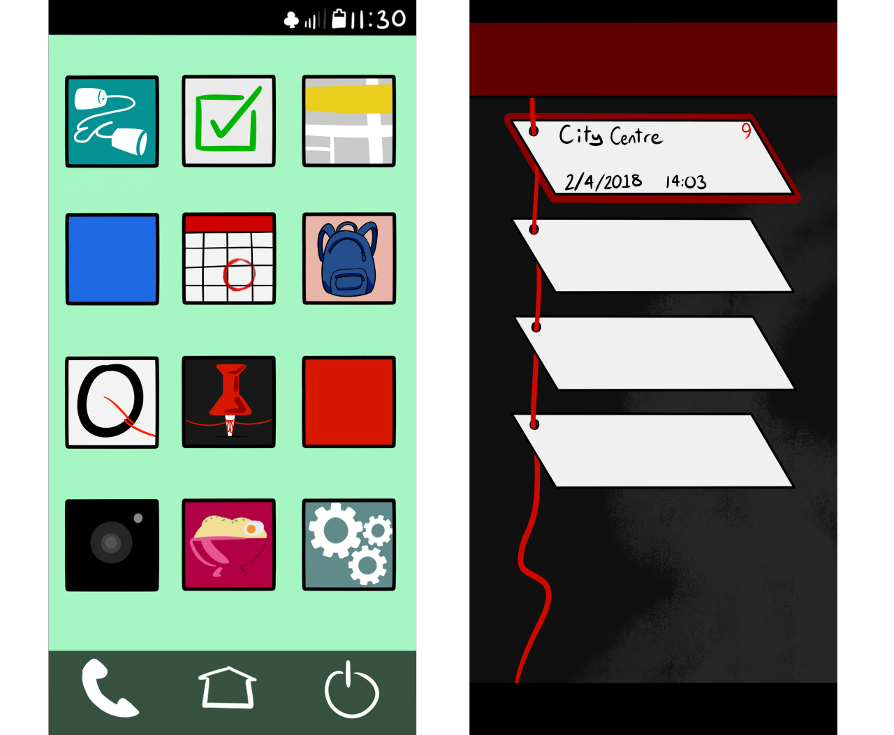
Menu: Our videos last week showed off the phone in it’s default form, as the overworld map, but it also takes on the role of the main menu. With apps that lead to all required functions like chatting with friends, game settings and saving. It acts as the central hub for the games menus.
At the moment the phone’s designs are in portrait, but we’ve very recently made the decision to change that to make better use of the space. We just haven’t got around to moving it all just yet.
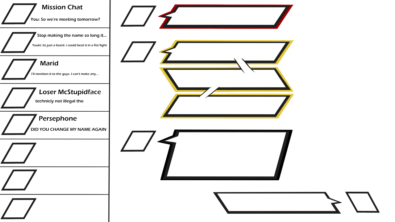
Etherchat: A large part of the game will be spent building up friendships and dealing with everyone else’s problems. We wanted the Messaging App to feel close to the dialogue system that we’re going to show off eventually, and a lot of the UI has the distinct rhombus shape (seen in the HUD and battle UI.) We wanted a kind of comic book feel since the game, for the most part, focuses on a group of young adults with superpowers.
–
That’s all we have for UI at the moment. We’re still fine tuning a lot of things that function, but don’t look their best. Even now a year down the line we’re still making pretty big changes as we learn what works and what doesn’t.
Don’t worry next week will be a lot more exciting as we finally show off some actual core gameplay!
– Kadan & Dan – Team Atropos